Suggestion: Make Transport Missions Easier to Navigate

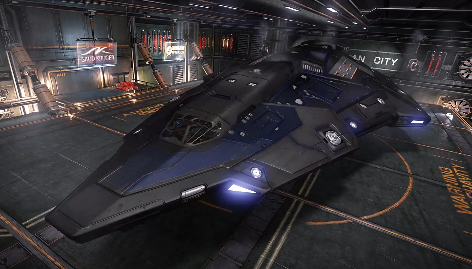
Simple, easy suggestion: the mission depot is currently extremely confusing for new players (source: was new, was confused). It's not clear why the cargo still says "0 / 196" even when you've loaded it up. Not clear why you have to go to a separate menu location to turn them in. Not clear why accepting them dumps you out of the mission menu.
UI-wise, it's a mess. We've just gotten used to it.
-
Have a nice big "Cargo loaded" indicator when we're in the depot.
-
When we click "Back" after loading cargo, take us, you know, back to the mission menu where we were.
-
Allow us to turn in all types of missions in one place. Probably the place that says "Missions". There's no reason to separate cargo missions from others.
That's all! Thanks to FDev for a fantastic game as always, wouldn't be here typing this out if I didn't care!
Recent Posts
Ledx have been so hard for me this wipe
Not being able to craft them sucks. Especially when everyone I talk to about it…
My interesting and unfortunate Gwent life
First I'd like to say I absolutely love this game it's quality. Basically I first…
Teacher Tuesday 12/Dec/2023 – ask your questions here!
Welcome to Teacher Tuesday, a thread where anyone can ask any type of question without…
This games balance is confusing
I’m kind of new/returning to gwent I played beta and obviously it’s a lot lot…
Summary of 10 Days of Draws from Chaffee’s Bundles
Level 1 Bag (Free with Atmosphere Level 2) 6 small consumable (First Aid, Repair, Fire…


