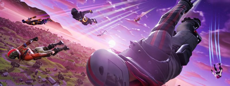
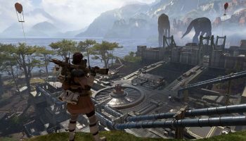
There’s a lot going on with the UI. The last time we got an UI change was 2018. There’s just too much going on. The chat doesn’t disappear even if no one’s typing anything, the abilities and item slots take up most of the bottom screen, the team health bars are big, it shows the name of the home base even if you don’t need to know the name, the challenge guide takes up a lot of the right side of the screen. What if we could just open the map and see the challenges. The giant timer at the top could work if it’s a small timer below the minimap like battle royale.
Ideas: add the health bars at the bottom left, show the item slots in the same place but add a minimal design for the powerups, add a square minimap with the timer under the minimap and only show challenges when you open the map, remove the name of the Homebase except for in the menu, allow people to open and close chat with a designated button.
Any thoughts?
Source: https://www.reddit.com/r/FORTnITE/comments/su2nan/its_guaranteed_we_dont_get_anything_new_but_the/
