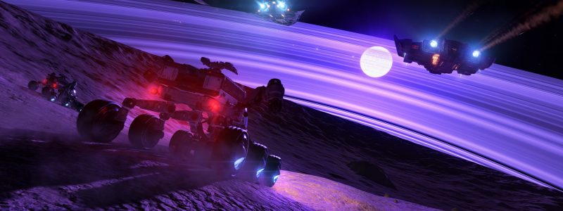
Since Elon Musk took over Twitter and is actively turning it into a cesspool of scum, I have not been using it to post Elite screenshots and have taken a closer look at the gallery on Inara. I don't really enjoy it though as I think the design is quite static and discourages engagement. So here are some suggestions:
- Allow comments on images (duh).
- Fundamental changes needed to the user interface, even in fullscreen mode the image is partially blocked by the like button. That is AFTER manually making the other crap go away by pressing an additional button. This is supposed to be about viewing the pictures, so a clean, unobstructed view should be DEFAULT.
- Slightly related to the previous point, image title and description should be visible on the right hand side as well as a clean, unobstructed view of the image, all at the same time. Users should not have to choose between reading the description and viewing the picture. And then of course there should be the option for full screen mode where we would be able the appreciate the screenshot with nothing else visible.
- Not sure what causes this, but currently any video content I try to watch there crashes in a couple of seconds. Maybe it has something to do with the ad content from YouTube clashing with Inara's interface. In any case, I think there should be a separate tab for videos only, photo and video content mixed together is quite messy and disorganised.
If there is anything incorrect in the above, let me know, it is always possible that I missed something. Do you use Inara for posting your screenshots? Do you spend any time looking at the gallery?
Source: https://www.reddit.com/r/EliteDangerous/comments/zoeip8/inara_screenshot_gallery_could_use_some/
